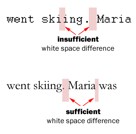
Many learned to make two spaces behind a sentence in school, but you are not using a typewriter anymore, so just insert one space. Why space-space is a no-no? First of all, most typewriters used non-proportional fonts where every character is of the same width. For instance, consider a word like “skiing.” The lower-case i takes up the same space as the n. Having the two “i” after each other means there is a lot of white space. While reading, our minds separate sentences based on space between sentences. But, if there is an “m” at the end of a sentence, followed by another wide character, only separated by a period and one space, the resulting white space visually appears to be less than between two “i.” In other words, typewriter typefaces were designed in a way that all the characters occupy the same amount of space. These are so-called non-proportional fonts or monospaced typefaces (wide characters are squeezed; narrow characters are unnaturally wide). An example for such a monospace font is Courier. See the example below.

Figure 1: This white space is a visual cue for transitioning between sentences. However, if the space between narrow characters is too wide in comparison to the white space after a sentence this cue does not work.
However, practically all fonts used on computers are proportionally spaced typefaces, where the width of each character is customized to accommodate the natural shapes of the characters. As a result, the type sets more tightly, which makes word spaces stand out more. And, to conclude, this makes a single space after a sentence a sufficiently large white space, or visual cue, to separate two sentences. When I explain this I often hear that people understand this, but for them after decades of writing like this there is no way they can change the habit of adding an extra unnecessary space after a sentence. You can try to use AutoCorrect options in your text processing software replacing automatically “period-space-space” with “period-space.” However, this does not work for Microsoft Word 2003.

