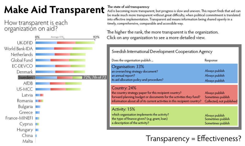
I am currently, together with more than 2,000 people, enrolled in a MOOC “Introduction to Infographics and Data Visualization.” This course is directed by Alberto Cairo who teaches Information Graphics and Visualization at the School of Communication at the University of Miami since January 2012. He holds a BA in Journalism (University of Santiago de Compostela) and a research-oriented Masters degree on Information Society Studies from the Universitat Oberta de Catalunya (Barcelona). He is author of The Functional Art: an Introduction to Information Graphics and Visualization, published by PeachPit Press, a division of Pearson Education, in August 2012. Watch the short introductory video by Alberto Cairo here. For the third week of the course, we had to create an infographic using the Guardian Data Blog as a source. We downloaded the data from that same post which deals with the transparency of humanitarian aid agencies. The original report is here. Our goal was to think about how an interactive graphic based on those same data should look like. Here my submission: I found the biggest issue with the data and most presentations that it is very hard to understand the meaning. For instance, even knowing that Sweden’s response to “Does this organization publish the country strategy paper for this recipient country?” was 4 doesn’t mean much. I believe the challenge is to make the data transparent (pun intended) without forcing the viewer to spend an hour drilling into the details of the report as most of us probably did.Thus, my goal was to avoid any coding, such as “4” for “Always publish,” but instead write it in clear text. The big question is, and I could not avoid putting this into my infographic, does transparency translate into effectiveness. I somehow fail to see the connection and cannot refrain from wondering if the prime goal of any aid is effectiveness, i.e. helping people. But, this is obviously a question beyond the data and the visualization. Technical note: I have produced this infographic using Adobe Photoshop CS6. I have used only vector graphics, except for the bars which I quickly made in MS-Excel, then took a screenshot and performed a Free Transform until they fit. Font is Hypatia Sans Pro. You can download the layered Photoshop file here (500 KB zip file).

Figure 1: Make Aid Transparent (click on the image to access a larger version)


